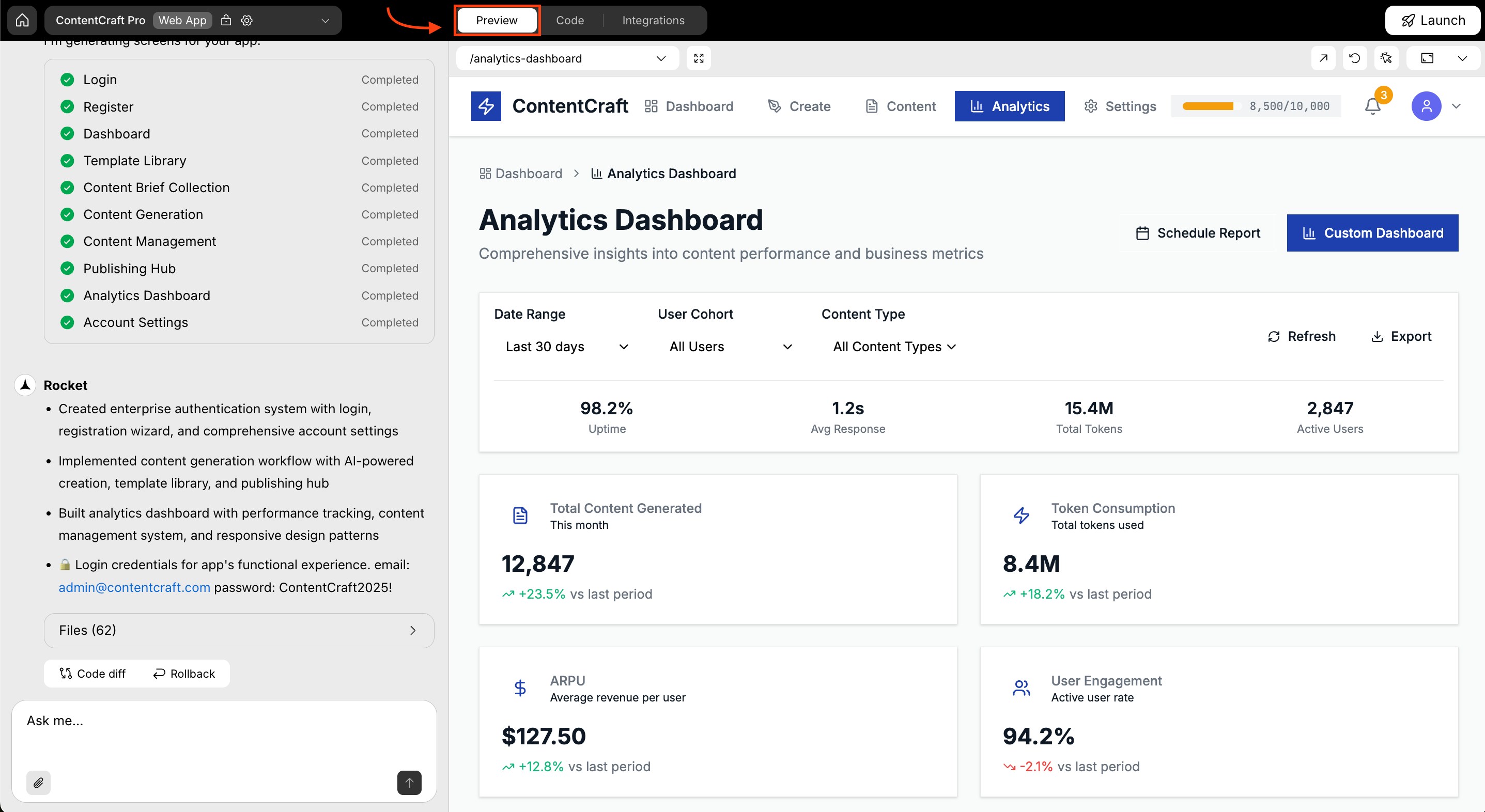
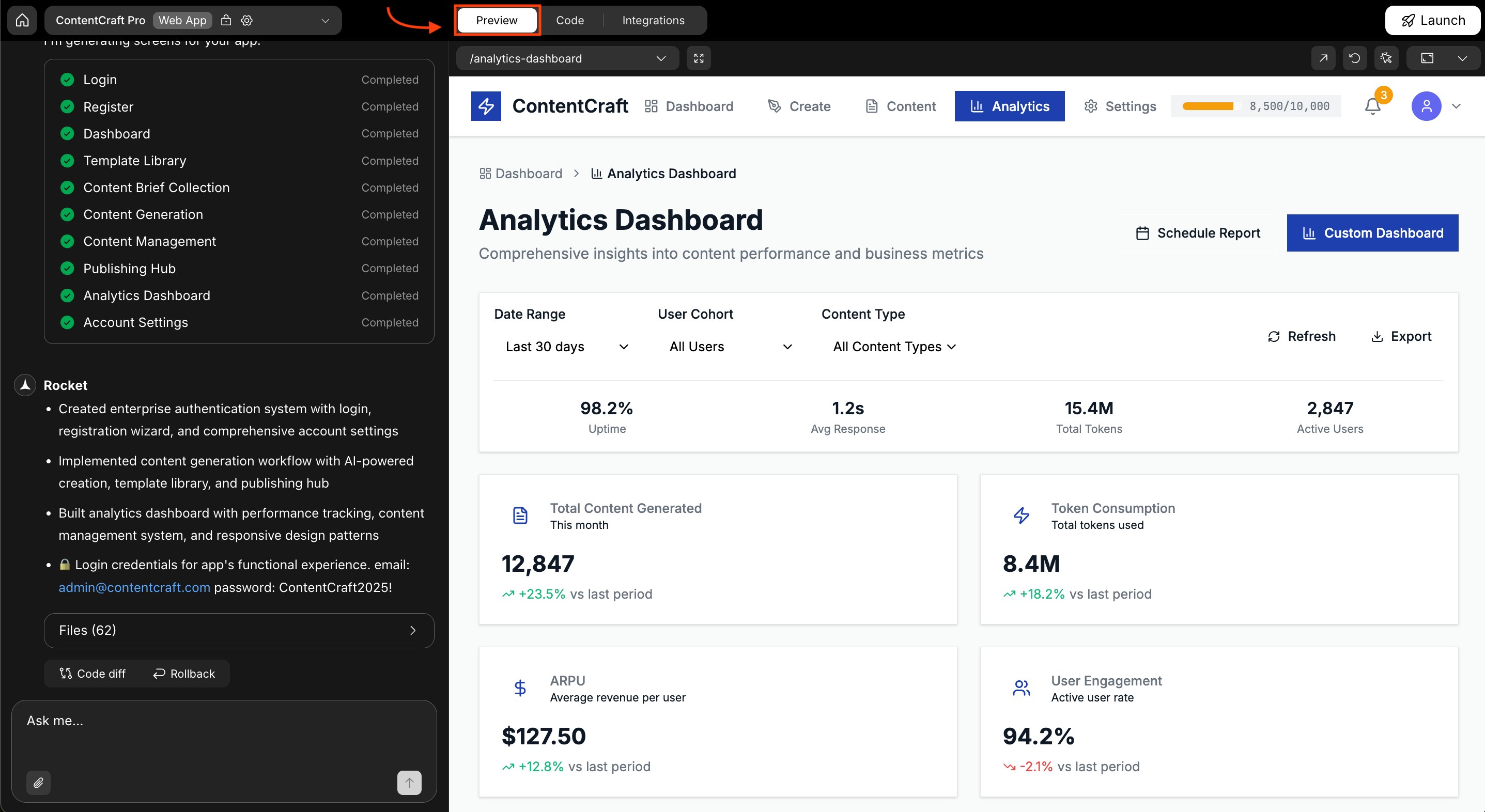
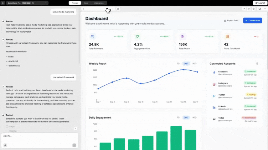
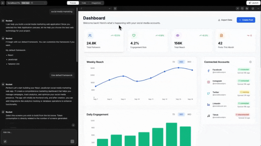
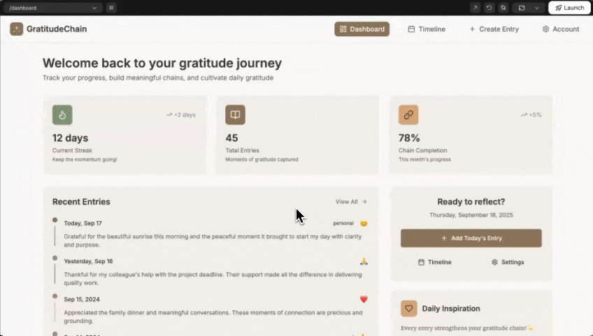
See your app running live as you build.Test pages across screen sizes, click through user flows, capture screenshots, and make visual tweaks, all without deploying (publishing your app online).The preview panel is a browser built into Rocket.You need an existing Rocket project. Do not have one yet? Create one to get started.
What you can do in preview
| Action | How |
|---|---|
| Test your app on different screen sizes | Use the responsive controls to switch between desktop, tablet, and mobile views. |
| Click through user flows | Navigate your app like a real user to verify routing and interactions. |
| Capture screenshots | Take full screen or selected area screenshots and drag them into the chat. |
| Make visual tweaks | Click any element to open Visual Edit and change it directly. |
| Open in a new tab | Launch the preview in a full browser tab for a better testing experience. |
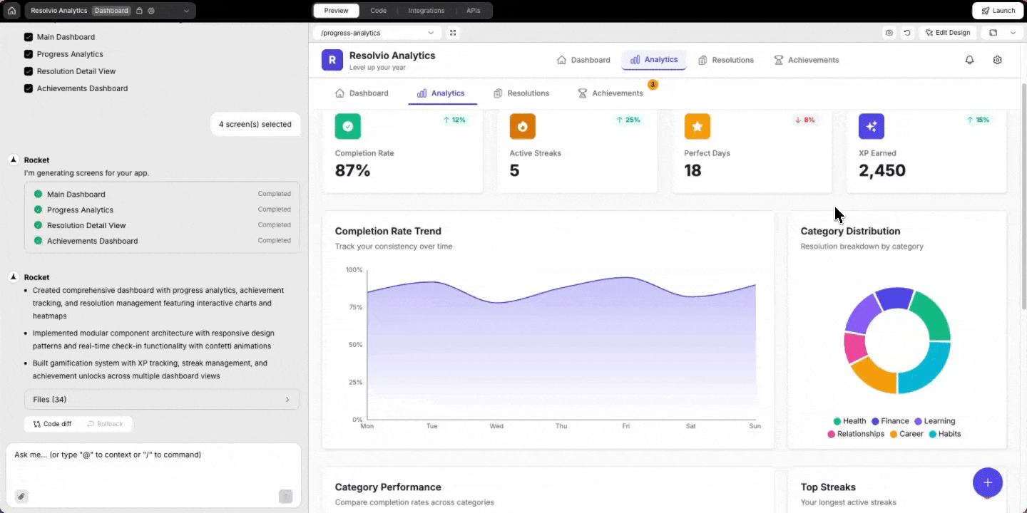
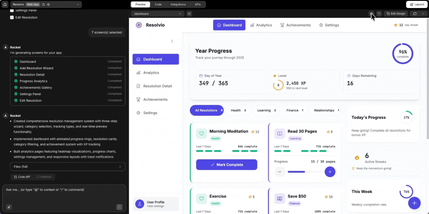
Getting started
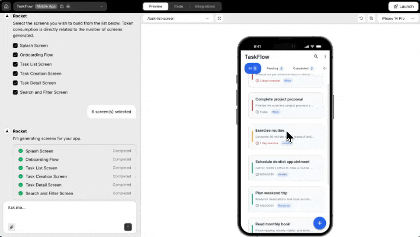
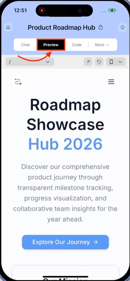
Click Preview in the top navbar to open the preview panel. It launches a live view of your app that updates as you build.- Web Browser
- Mobile App
Preview features
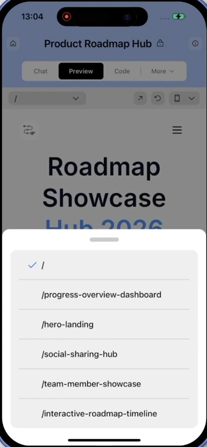
Choose a screen to preview
Use the Currently viewing dropdown to switch between screens in your app.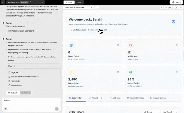
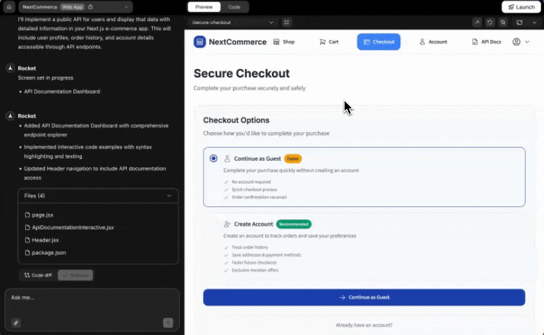
Success check: The selected screen loads instantly in the panel.
Full screen preview
Click the icon next to the screen selector to expand the preview to full screen and hide the chat panel.Use full screen when:- The preview feels cramped with the chat open.
- You want to test your app in a larger view.
Refresh your preview
If your changes are not visible yet, click the Refresh icon in the top-right of the panel.Success check: The panel reloads and displays your latest updates.
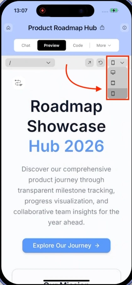
Preview responsive views and device models
Click the Device icon in the top-right corner to test how your app looks across different screen sizes and devices.- Web projects
- Mobile projects
Available views: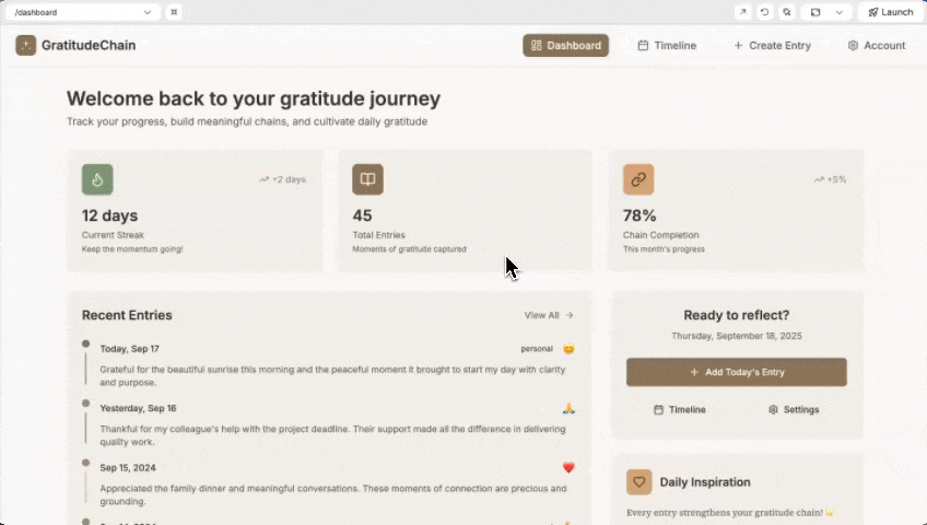
- Desktop
- Laptop
- Tablet
- Mobile
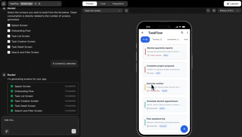
Success check: The preview resizes to match the selected device or screen size.
Edit visually in the preview
Click the Edit button in the top right corner to enter visual edit mode. Select any element and adjust its text, style, spacing, or image directly in the preview.Learn more about visual edit tools and what you can change.
Capture screenshots
Take screenshots directly from the preview panel and use them in chat.- Click the Capture screenshot button in the top-right of the preview panel.
- Choose your capture mode:
- Full Screen: Captures the entire preview area.
- Selected Area: Click and drag to select a specific region.
- After capturing, drag and drop the screenshot into the chat input.
Success check: The screenshot appears in the chat input after dragging.
What’s next?
Visual edit
Click on any element to change styles, spacing, and content visually.
Chat interface
Build and iterate on your app through natural conversation.
Deploy your app
Publish your app to a live URL and share it with the world.