Why overlay design matters
Overlays like dialogs, drawers, and bottom sheets are powerful UI components, but they need to follow certain practices to be identified correctly during import.
Requirements for dialogs, drawers, and bottom sheets
When designing these components, make sure to include three essential elements: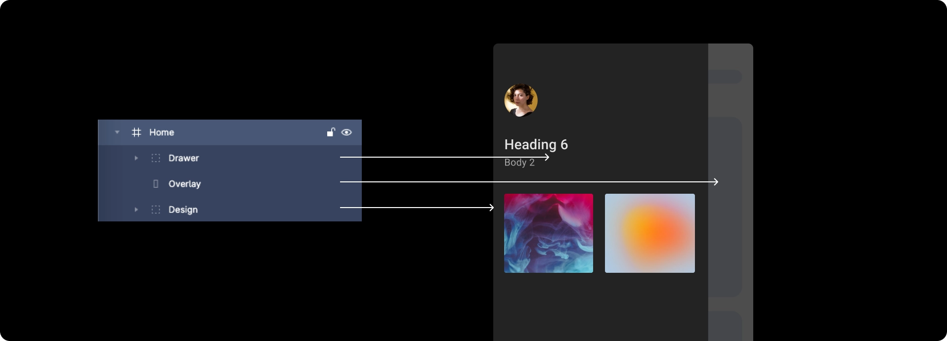
Common issues occur when overlays do not cover the screen fully, or when dialog edges extend beyond the screen bounds.
Following the practices below ensures your overlay components are detected correctly.
Following the practices below ensures your overlay components are detected correctly.
Best practices
-
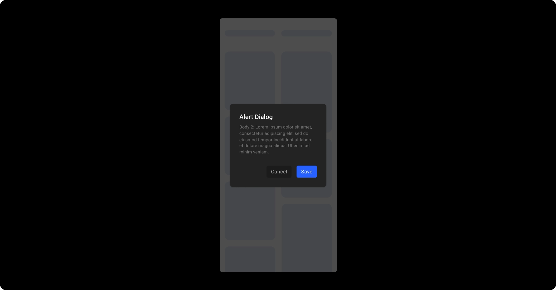
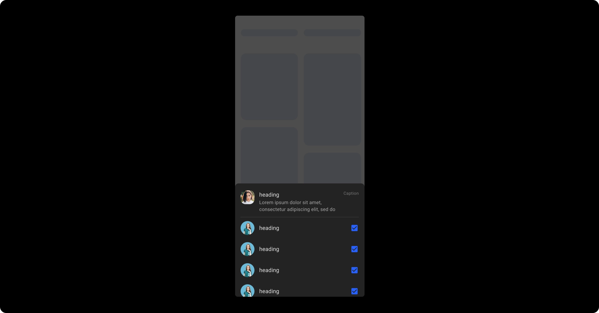
The overlay should cover the screen completely.
If it does not, the dialog, drawer, or bottom sheet will not be detected. - Place the component in the correct position inside the overlay:
- Dialog → exact center of the overlay
- Bottom sheet → aligned to the bottom
- Drawer → aligned to the left
- Maintain the correct hierarchy of layers:
- Top: dialog, drawer, or bottom sheet
- Below: the overlay layer
- Bottom: everything else in the screen
Reference designs
- Dialog
- Drawer
- Bottom sheet

Back to guidelines
See all design guidelines for preparing your Figma files.